In Canada’s competitive advertising landscape, yard signs remain a cost-effective, high-visibility marketing tool. Whether promoting a political campaign, a real estate listing, or a local service, the colour combinations you choose can make or break your message.
This comprehensive guide explores the best colour combinations for yard signs in Canada, backed by colour psychology, industry trends, and the latest SEO strategies as of 2025.
Why Colour Choice Matters for Yard Signs
Colour influences perception and decision-making. When used strategically, colours can:
-
Grab attention quickly
-
Improve readability
-
Convey emotion and tone
-
Reinforce brand identity
-
Encourage action (like a phone call or website visit)
Studies show that colour increases brand recognition by up to 80% — meaning your sign’s colour scheme isn’t just decoration; it’s a vital marketing decision.
Top Colour Choices for Yard Signs in Canada
1. Blue – Trust, Professionalism, Calm
Blue is a top choice for corporate signage, real estate agencies, and political candidates. It conveys reliability and security — values that resonate well with Canadian consumers. Dark navy and bright blue both work well when paired with white or yellow text.
Best for: Law offices, financial services, political campaigns, realtors.
2. Green – Nature, Growth, Health
Green represents freshness and sustainability. Canadians associate green with eco-consciousness, making it ideal for health clinics, landscapers, and environmental initiatives.
Best for: Garden services, health practitioners, green businesses.
3. Red – Urgency, Action, Energy
Red demands attention. It’s bold, energetic, and emotionally intense. It’s perfect for limited-time offers or signs that require immediate action. Use with caution — too much red can be overwhelming if not balanced properly.
Best for: Sales, grand openings, events, clearance promotions.
4. Yellow – Positivity, Visibility, Optimism
Yellow is eye-catching and cheerful. It’s one of the most visible colours from a distance, especially in cloudy or snowy Canadian weather. When paired with black or dark blue, yellow provides high contrast.
Best for: Daycares, food trucks, family events, community services.
5. Orange – Creativity, Confidence, Motivation
Orange blends the urgency of red and the optimism of yellow. It’s dynamic and youthful. In Canadian markets, it stands out against green backdrops like lawns and parks, making it ideal for yard signs.
Best for: Startups, contractors, local events, new services.
Recommended Colour Combinations for Maximum Impact
1. Blue & White
-
Professional and clean
-
Excellent readability
-
Trusted combination in Canada’s corporate and real estate world
2. Green & White
-
Fresh and environmentally friendly
-
Reinforces messages of health and sustainability
3. Red & Yellow
-
High energy, high visibility
-
Ideal for urgent promotions or temporary signage
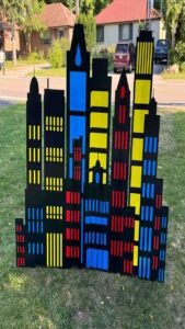
4. Black & Yellow
-
Extremely readable
-
Great contrast for safety or caution-oriented signs
5. Orange & Black
-
Bold and modern
-
Excellent for youth-driven or creative campaigns
6. White Background with Bold Lettering
-
White offers a neutral canvas
-
Combine with navy, red, or forest green lettering for strong contrast
Tips for Designing Effective Yard Signs
✅ Prioritize Legibility
-
Use bold, sans-serif fonts
-
Keep words large and simple
-
Avoid clutter – your sign should communicate the key message in 5 seconds or less
✅ Use High Contrast Colours
-
Black on yellow, white on blue, and dark text on light backgrounds are easier to read from a distance
-
Poor contrast can ruin an otherwise well-designed sign
✅ Think About Local Weather
-
In snowy Canadian provinces, high-contrast colours like red on white or black on yellow are easier to spot
-
UV-resistant inks and materials are a must for long-term outdoor use
✅ Align Colours with Brand Identity
-
Use your existing brand colours to maintain recognition
-
If your business lacks an established palette, choose colours that match your values and target audience
Canadian Trends in Yard Sign Colour
According to design data from Canadian printing companies and signage providers:
-
Eco-friendly colours like green and earth tones are on the rise
-
Minimalist palettes with two main colours dominate in urban markets
-
Bilingual signage (English & French) is gaining traction, especially in Quebec and bilingual neighbourhoods
-
Reflective and matte finishes are trending for nighttime visibility and glare reduction
Conclusion
In 2025, colour is still king in effective yard sign design. With a strong understanding of colour psychology, brand alignment, and visibility needs, you can create signage that doesn’t just get noticed — it converts.
Whether you’re a real estate agent in Toronto, a contractor in Calgary, or a political candidate in Montreal, the right colour combination can help you rise above the noise and rank on Google and in your community’s mind.
Need help designing or printing your signs? Partner with a local Canadian print shop that offers custom yard sign design and UV-protected materials for long-lasting results.