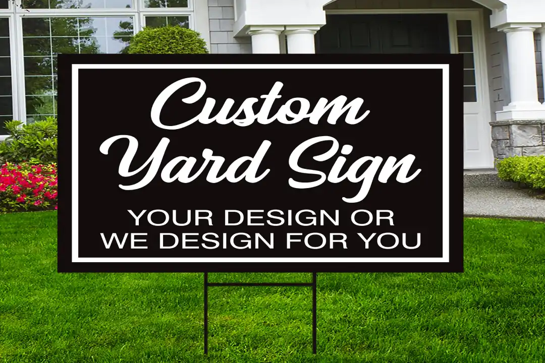
When it comes to designing a yard sign, one of the most important factors to consider is its visibility. Whether it’s for a political campaign, a business advertisement, or a real estate listing, a yard sign needs to catch attention and convey a message quickly and effectively.
The best fonts for outdoor signs can play a significant role in ensuring that your sign stands out and is easily readable from a distance. Choosing the right typography goes beyond aesthetics; it is an essential aspect of communication that impacts the effectiveness of your message.
Understanding the Importance of Font Choice
The choice of font on a yard sign can directly influence how your message is perceived. Fonts that are difficult to read or poorly designed can frustrate passersby, resulting in the loss of potential interest.
Clear, legible fonts enhance visibility and improve comprehension, which is essential for the success of outdoor signage. Let’s explore the key elements that make a font suitable for yard signs and review some of the top fonts for sign readability.
Key Factors for Choosing Yard Sign Fonts
1. Legibility
Legibility is the primary factor when choosing readable fonts for yard signs. It refers to how easily a person can distinguish individual letters and words from a distance. Fonts with a simple structure, minimal ornamentation, and ample spacing between letters are typically the most legible.
2. Visibility
Visibility ensures that your yard sign can be seen from a distance. Bold, high-contrast fonts help your message stand out in various weather conditions, lighting, and environments. Fonts that are too thin or faint may not be visible in the glare of the sun or during cloudy days.
3. Font Size
The size of your font plays a pivotal role in ensuring readability from far away. A larger font size ensures that even those who are driving by can read your sign without squinting or slowing down. It’s essential to balance font size with the available space on your yard sign, maintaining clarity without overcrowding.
4. Appropriateness
The style of the font should align with the tone of the message you are conveying. For example, a professional sign may benefit from a more formal, serif typeface, while a fun or creative sign may lean towards a more playful, casual font. Ensuring that the font matches the purpose of your message is essential.
When selecting a font for an outdoor sign, several typefaces stand out due to their superior readability and visibility. Some of these fonts are widely recommended for both professional and personal signage. Below are a few of the best fonts for outdoor signs.
Also Read: Choosing the Best Material for Durable Yard Signs
1. Helvetica
Helvetica is one of the most popular fonts in the world of signage. Its clean lines, neutral appearance, and simple structure make it ideal for outdoor signage. Helvetica’s bold fonts for yard signage are particularly effective at ensuring high visibility, making it perfect for street signs, real estate ads, and other applications where clarity is key.
2. Impact
Impact is another font that is often used for yard signs. As the name suggests, it is a bold, eye-catching typeface that is easy to read from a distance. It is an excellent choice when you need your message to make an immediate impact. Impact is commonly used in large, high-visibility signs for events, sales, and political campaigns.
3. Arial
Arial is a widely used sans-serif font that is known for its simplicity and legibility. Its clear structure makes it easy to read, even from afar. Arial works well for both short and long messages, making it an ideal option for best lettering styles for yard signs that need to convey essential information in a minimal amount of space.
4. Futura
Futura is a geometric sans-serif typeface with a modern appearance. It is often used for outdoor signage because of its ability to maintain legibility even at large sizes. Its clean and balanced design helps achieve high visibility, making it one of the best typefaces for yard signs.
5. Verdana
Verdana is designed specifically for digital screens, but its highly legible nature makes it an excellent choice for yard signs as well. Its wide spacing and clear letterforms ensure that the text remains easy to read from a distance, which is crucial for outdoor signage.
6. Garamond
While not a sans-serif font, Garamond is a classic serif font that can be used effectively on yard signs that require a more formal appearance. Its elegance and readability make it suitable for yard signs that convey more serious messages, such as real estate listings or business advertisements.
Choosing the Best Sign Lettering for Visibility
While the font is important, the lettering style also affects the overall readability of your yard sign. The style of lettering can influence how easily a viewer can recognize and process the text. The best sign lettering for visibility should be bold and clean, with minimal decoration that could distract from the message.
1. Bold vs. Regular Fonts
When selecting fonts, it’s often best to go for bold styles. Bold fonts make the text thicker and easier to see from a distance. They stand out more clearly against the background, ensuring that your message is visible even from moving vehicles. For example, bold Arial or Helvetica fonts will ensure that the text remains readable in various lighting conditions.
2. Spacing and Lettering Height
Proper spacing between letters is crucial for readability. Overcrowded text can make it difficult to distinguish individual letters, leading to confusion and misinterpretation of the message.
Make sure there is adequate space between each character and word. Additionally, increasing the height of the lettering will ensure that the text is visible from a greater distance.
Best Lettering Styles for Yard Signs
The lettering style refers to the overall design of the letters, which impacts the readability and aesthetic appeal of the sign. Several factors influence the choice of lettering style, including the purpose of the sign and the environment in which it will be displayed.
1. Sans-serif Lettering Styles
Sans-serif fonts are generally the most effective for yard signs. These fonts lack the small lines or flourishes at the ends of letters, which makes them appear cleaner and easier to read from a distance. Examples of sans-serif fonts include Arial, Helvetica, and Verdana.
2. Serif Lettering Styles
Serif fonts, which feature small strokes at the ends of letters, are often seen as more formal and traditional. While they can be effective in certain contexts, they are generally less suitable for yard signs, especially when legibility from a distance is crucial. However, fonts like Garamond may work well for signs that require a more sophisticated appearance.
3. Script Fonts
Script fonts can add a personal or artistic touch to a yard sign. However, these fonts are typically not as readable from a distance. They are best used sparingly and for smaller signs where the message is not critical for quick comprehension.
Also Read: Yard Sign Printing for Parties
Final Thoughts
Choosing the right font for your yard sign is essential for ensuring that your message is clearly communicated. Whether you are creating signage for a business, political campaign, or real estate listing, selecting the best fonts for outdoor signs can significantly impact the effectiveness of your communication.
Prioritize readability, visibility, and appropriate lettering styles to ensure that your message is seen and understood by as many people as possible.
Investing in high-quality fonts that are both bold fonts for yard signage and designed for readability is a step towards creating more effective outdoor signage. Remember that a well-chosen font can enhance your sign’s visibility and, ultimately, contribute to its success in achieving its goal.
FAQ
- What are the best fonts for yard sign visibility? The best fonts for yard sign visibility are bold, simple, and easy to read from a distance. Fonts like Arial, Impact, and Helvetica work great for clear readability.
- Which font styles are best for outdoor signs? Bold fonts with clean lines, such as Helvetica Bold and Verdana, are ideal for outdoor signs as they ensure high visibility in various weather conditions.
- What makes a font readable on a yard sign? The most readable fonts for yard signs are those that have large, clear letters and minimal embellishments. Sans-serif fonts like Arial and Roboto are great choices.
- How can I improve yard sign readability? To improve readability, choose fonts with high contrast, avoid overly decorative styles, and use large lettering. Bold fonts for yard signage ensure your message stands out.
- Can I use cursive fonts for yard signs? While cursive fonts can be decorative, they may reduce readability from a distance. It’s better to stick with simple, bold fonts for better visibility.